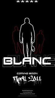
We created a poster for our Facebook page in which we will use to help our demographic recognise our thriller. A poster will allow us to promote our thriller and may lead to further views. In the real industry promoting the thriller is really important as money will be made by doing this.
This is one of the potential posters we wil be using. We decided to put a 5* rating at the top of the poster as we feel that the audience will feel like it is a really must see film. This could boost our viewing count.
It displays three different images of male silhouette figures. The villain is a different colour outline than the other characters and this is too really emphasise his authority over the film. We decided to use a silhouette because it will hide the identities of the figures untill the film is released, this may create tension to our audience and may want them want to find out who the characters really are.
The title is really bold and stands out from all the other parts of the poster. This is to catch the demographics eye and hope that they look out for our film in the future. A choice of faded text in the background was used to enhance the overall effect of the title.
We feel it was important to exclaim to the audience when the thriller will be available to watch because that way they can look out for it in the future. We used blood dripping text to potray some of the horrors that may appear in our film.
James Kinsella-Brown

No comments:
Post a Comment