Monday, 31 January 2011

Thriller Poster Analysis


In analysing the strengths and weaknesses of other major thriller posters, it allows us to achieve a greater understanding of what our poster should entail to fit into the theme of our thriller. It should also explain to us how to attain a successful design in order to captivate an audience. A poster will help determine a viewer’s overall perception of the film, and should build an image in the viewer’s mind, of what will happen during the film.

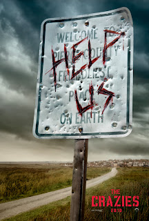
‘The Crazies Sign Poster’ successfully builds an image in the audiences mind in a number of different ways. To begin with, the film title is small and in the corner of the poster. This emphasises the importance of the image shown on the poster, and that the audience should focus on that part rather than the film title itself.

A large sign at the front of the poster has the letters “HELP US” engraved over the real sign lettering. This immediately exclaims to the viewer’s something terrible has happened to the people. The use of blood around the text initially suggests that violence is a major theme throughout the film and blood shed will be seen. Furthermore, this is backed up by the use of bullet holes across the sign, which gives an overall perception that death has a major significance in the film.

The use of the road from the start of the poster to the back will ensure that the viewer’s eyes will follow the road to see where it ends up and sure enough it leads to a town. At which point the audience will know that that town is in danger or already has been.

Dark clouds forming above the town suggest that something bad will happen or has happened, as darkness generally coincides with bad things happening. This is successful as the audience will be asking themselves the question, “what will happen to the town?” and will want to watch the film to find out.

In conclusion the design of the poster has been creatively put together in order to not only aesthetically please the audience but also to mentally prepare them for what they are about to view. When we are designing our poster we must think of an effective way of how to lure our audience in.
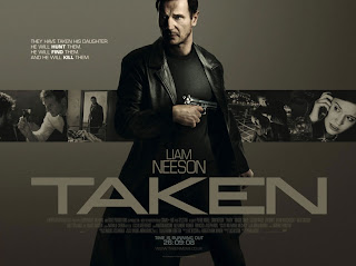
'Taken' is a crime thriller starring Liam Neeson and the strength of the poster entices the person who see's it. The way it has been structured makes the audience question what has happened and why. The main picture is of the protagonist in the film, he is holding a gun and is in a large trench coat, dressed in black. From this we can take several connotations. The gun has several connotations of power and danger, as by having a weapon like this, the person with the gun in the scenes, usually hold power. The large trench coat can be associated with other types of thrillers like 'The Matrix' and 'Jumper'. He is wearing all black and once again we can connotate danger and power. The fact that he is a man may also contribute as men are seen to be more aggressive, especially in films.

In the top left corner there is a few sentences affiliated with the film, it says "they have taken his daughter","he will HUNT them", "he will FIND them", "and he will KILL them". Immediately from this we find out the plot and begin to feel emotionally involved with the character as we share a sense of sympathy and support towards him. The use of the imperative verb 'will' tells us about the character and the film, and how he will stop at nothing to find his daughter and act out revenge.

The title 'Taken' creates a question and expectation in our head, as we wonder "What has been taken? Who has been taken? Why?" by doing this it entices the watcher to see how the story develops and how the characters involved come out of the story.

James Kinsella-Brown & Tom Smith

Sunday, 30 January 2011

Preliminary Task - Marking other student's work


We decided to mark another group's preliminary task so that we could avoid error's that others may have made as well as our own. It will also help them improve their work.

The clip starts with a title, which takes up the whole screen and it displays the names of the group. This does not look very professional because it is only black and white and a standard font which gives the impression that not much effort has been put into the movie. This then fades into the clip which is nice and shows a characters walking down a corridor. A smooth pan is used to follow the character to the door and then match on action is successfully used as the door opens.

As the character walks inside the room, a jump cut is used which makes him jump across the room a little bit. If this happened in a real film then it would have a negative effect on the quality of the film and becomes unbelievable. The character also possesses a cheeky grin as he walks in, which again if used in a real film it would be unacceptable and may ruin the audiences perception of the film. The pan used here is worse than the first one because the pace is not consistent throughout.

As the characters talk, very quick over the shoulder shot's are used (which are at a good angle as all the attention is on the dialogue and not being distracted by objects in the background). The character who then exits the room has a very visible and distracting jump cut as he stands which would ruin a film. Overall, the preliminary would not be believable if it was a real film but some good shots and transitions are used. After analysing their preliminary they can improve their final work and make sure that no mistakes are made in their thriller.

Thomas Steer

Preliminary Task - Post Production

After we filmed the shots that we were going to use in our preliminary task we edited them in Sony Vegas 9 and Adobe After Effects CS5. The editing process took 2 hours including the time it took to render. This was quite a quick process as our main aim was to keep the editing clean and simple.

A fade was used at the beginning and end of the clip to increase the quality. This transition helps to establish the scene and end the scene. Both fades last for one second and are normally used when there is a change in scenery. 
Throughout the clip cuts were used when camera angles changed to give the audience a sense of location. The simple cuts improved the overall continuity of the clip.

We decided to use a non-diegetic soundtrack for the opening of the preliminary task. The track was very jolly and gave the clip a calm mood. The soundtrack stopped when there was a change between non diegetic and diegetic sounds, this was done so that the dialogue could be heard clearly. 

After uploading our preliminary task to youtube we gained lots of comments and views which has helped us dramatically. The comments will help us when we come to making our thriller as we will improve the camera shots and make sure no minor errors are made.


Alex Cirino


Friday, 28 January 2011

Preliminary Task - Production

The clip starts with a fade into an establishing shot, and we used a tripod to steady our shot as the student walked down the stairs. As he exits the stairs we switch to a mid shot, showing the student walking towards the door. We then cut to a shot of the door and the student, we positioned the camera to give the best chance of student being in the centre of frame, if we hadn't of done this the eyes of the audience would be drawn to the door as opposed to student. After we use a medium close up of the door handle and the student opening the door. We had to reposition the camera several times to ensure the handle and hand are in the centre of the frame. Whilst doing this we had to ensure continuity with the last shot as the student reached to the door in the previous shot with his left hand, so in the current shot we made sure he opened the door with the same hand.

After he opened the door we moved the camera to the other side of the door, and this was our required match on action shot. As he walked past the camera, we panned it to show the teacher sat down in the room. By having a pan we can track his movement and see the surrounding of the room. The characters then exchange some dialogue and this was our opportunity to use our shot/reverse shot during the dialogue. After the conversation a 2 shot was used of both characters shaking hands and as the student walks away the shot fades to black.

A non-diegetic soundtrack was used in the beginning of the clip, we decided to use this clip as it suited the clip perfectly and it matched the speed of the student walking. It then switched to diegetic sound, as we hear the conversation between both characters.

Tom Smith

Preliminary Task - Video


This is our Preliminary video which we filmed over the course of a day. We used this task to practice camera shots, editing, mise en scene and sound. From this task we have learnt a lot about the four key topics so that when it comes to filming our thriller we can improve dramatically.

Thomas Steer, Alex Cirino, Tom Smith & James Kinsella-Brown

Preliminary Task - Pre Production

For our AS Media Coursework task we have been asked to produce, film and direct an opening to a thriller film. Before we start filming, we had to get to grips with the filming process, so were instructed to make a 30 second clip using our new skills. By doing this we can prepare, brainstorm and develop ideas for our thriller.

This is our storyboard which we are using for the preliminary task, it gives a simple step by step order of how the clips need to be filmed and the props which need to be included in each shot.

The clip has to to include certain a few features, this included a match on action shot, an over the shoulder shot, a panning movement of the camera and a shot/reverse shot. In addition we need a few lines of dialogue and a closeup of a door handle being opened. Whilst doing all of these things we had to adhere to the 180 degree rule. This is where the camera positions are kept on one side of the participants in a conversation and do not cross an invisible line running through the actors. By doing this the audience know where both actors are in relation to each other and prevents them from being disorientated.

Here is the script that we are going to use for our preliminary task.

Student: “You alright sir?”
Teacher: “Come sit down…. Did you bring your homework with you?”
Student: “Yeah sir”
Teacher: (Pause to look at the paper) “This is really good!”
Student: “Cheers sir”


Alex Cirino & Tom Smith

Mood Board


The mood board shown above consists of images which relate to the codes and conventions of a thriller. The characters created in each film normally have unnatural features such as scars which cause the characters to give a sense of fear to the audience. From viewing different characters and locations we have more understanding of what thriller's should consist of.


Alex Cirino

Codes and Conventions of a Thriller


Film Inspirations

When brainstorming initial ideas for our thrillers, we cited other thrillers for our inspiration. By acknowledging these films, we can begin to work together and have similar ideas and understand each others suggestions. Films like:
-The Strangers
-The Crazies
-Signs
-Panic Room
-Goodfellas
-Psycho
-Inception
-Terminator
-The Dark Knight
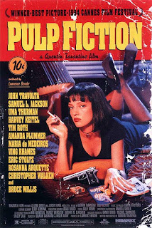
-Pulp Fiction

Tom Smith

Initial Ideas

We have sat down and discussed initial ideas that could be included in our thriller. We have decided that we would like to do a horror/psychological themed thriller as we think that we can produce an effective film in this style. We have thought about how use of mise en scene, cinematography, editing and sound will be used to create an effective film introduction.

Ideas include:
- Masked man chasing victim
- Gloomy forest location
- Abandoned house
- Old run down hospital
- Someone wakes up in nightmare and then person being chased is dead outside window
- Flashback
- Blood on walls
- Night time during chase with the villain holding a torch
- The use of fire to express danger
- Chaser wearing a boiler suit to hide identity
- Scary/suspenseful soundtrack used at correct points
- Things that make the viewer jump to keep them on edge
- The use of knives or other weapons
- Not too much light used (e.g. Not a summers day)
- Establishing shot of forest
- Rapid editing to express the chase
- Point of view shots to make the audience feel involved

Thomas Steer

Year 13 Tips

The year 13 media students came to talk to us about our projects. They gave us tips and hints in what to do, what not to do, what to include, and not to include. This talk was very important as we picked up some vital tips which will help the production and filming of the project.

They told us planning is vital, and if we don’t plan the shots we need to get on each day, and what equipment is needed, the production of the thriller may be hampered or stalled. We also need to learn how to use all the equipment, so our shots look professional. Continuity is important also, so we have to ensure the settings, costumes, etc. don’t change between shots, and to avoid silly mistakes, like reflections in mirrors and leaving equipment in shot. We should also look into having high quality and realistic props.

We were also told to film more than we actually needed, so when we go to edit we can pick and choose the best shots. Shooting from various angles and using different types of shots, will make our film look more professional and makes editing easier. Using original locations makes our film look more professional.

Having these tips makes the filming, production and editing process much easier, and will increase the quality of our project.

Tom Smith